We changed the Progressive Alliance Corporate Design March 2017. The new Corporate Design is easy to handle. We present you some essential application possibilities and examples how to use it. Please have a closer look, handle it carefully and contact us, if you have any further questions.
Logo Standard
| cmyk: 0 | 100 | 80 | 20 | |
| cmyk: 57 | 0 | 100 | 0 | |
| cmyk: 100 | 10 | 0 | 10 |


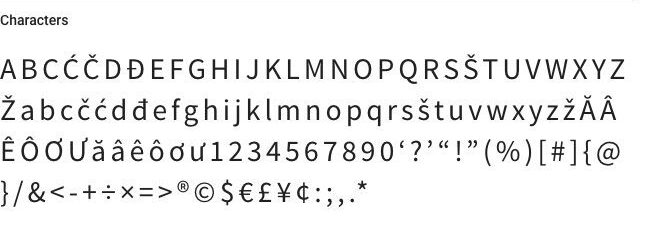
Font: Source Sans Pro
Always use the font “Source Sans Pro”. Never use any other font type! “Source Sans Pro” from Adobe Systems Incorporated is licensed under the SIL Open Font License, Version 1.1. That means that you are allowed to use the entire font-family free of charge. You will find the Download-Link below.
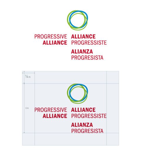
Logo Square
If you get size/expanse problems, for example with small or squared surfaces, slim vertical banners or if you would like to couple the logo with event-titles or slogans use the squared Progressive Alliance Logo. See below how to combine Logo and Type correctly

Logo Multilingual
In some exceptional cases it makes sense to fall back on the multilingual version of the Progressive Alliance logo. For example at the rear wall of the press box. You are not allowed to couple the multilingual logo with any event-title or slogan.
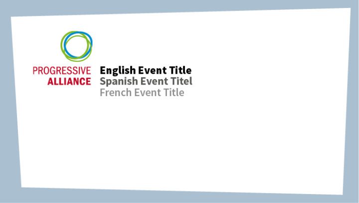
To couple the logo with any event-title or slogan, please follow this instructions. For multilingual event titles (that should be single lined only!) use three different font styles: black, bold and regular as well as three different colors. Please have a look at the diagram below.

| cmyk: 0 | 0 | 0 | 100 | |
| cmyk: 0 | 0 | 0 | 80 | |
| cmyk: 0 | 0 | 0 | 58 |
For multiple line text (that should be monolingual only!) use “Source Sans Bold”, 100% black. Please have a look at the diagram below.

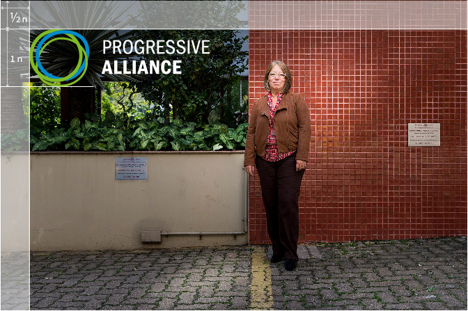
Logo white

In addition to the logo: further brand elements
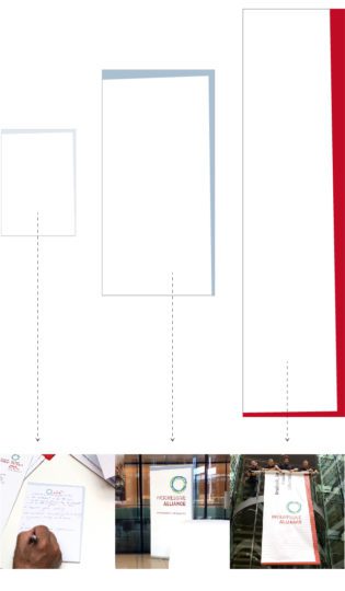
- light blue-gray for decent materials such as writing blocks
- blue-gray for bigger and more present materials such as roll-ups, posters or banners
- red only for selected materials. Use red intentional and rarely. Red ist the distinguishing color
| cmyk: 14 | 6 | 5 | 0 | |
| cmyk: 38 | 18 | 14 | 0 | |
| cmyk: 0 | 100 | 80 | 20 |
Dos and Dont's
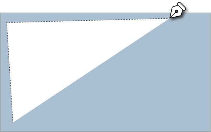
- Never use pure white backgrounds. Always play with the trapezoid shape.
- Never use ornamental or colored background elements. Always play with the trapezoid shape.

Backgrounds
- Background color is always cmyk: 38 | 18 | 14 | 0
- No other colors allowed!
| cmyk: 38 | 18 | 14 | 0 |
